Designing Buzz Lightyear’s Launch: From Collector's Shelf to Intergalactic Icon
As Creative Director at CRISPx, I led the branding and packaging experience for the Buzz Lightyear x Robosen collaboration, transforming the iconic space ranger into a premium tech collectible through minimalist design, strategic brand storytelling, and multi-channel campaign execution.
Elevated Packaging for a Premium Experience
We approached the packaging with a clean, futuristic aesthetic that reflected Buzz’s legacy and Robosen’s robotics innovation. Every detail was intentional, from the crisp layout to the restrained use of color, designed to convey modernity and collectible value.
Messaging That Mattered
Brand signals like the Robosen and Disney/Pixar marks were positioned for immediate recognition and licensing trust. We introduced the line “Technological Innovation & Free Action” front and center, setting expectations for an advanced, interactive experience. A scannable QR code brought the unboxing moment to life, linking to exclusive content that extended the customer journey beyond the box.
Building Anticipation: Strategic Rollout
Pre-Launch: Mystery Meets Fandom
Borrowing insights from our successful Elite Optimus Prime launch, we kicked off with a teaser series across social, abstract visuals, subtle sound cues, and shadowed silhouettes designed to activate curiosity without giving too much away. The campaign was aimed not just at kids, but adult collectors and tech enthusiasts alike.
Launch: Multichannel Activation
The official launch was built around share ability and surprise. My team crafted dynamic content that showcased voice commands, gesture recognition, and Buzz’s iconic phrases in action; all presented in a cinematic style for platforms like Instagram Reels, YouTube Shorts, and TikTok.
Our goal was twofold:
Drive interaction.
Make users feel like they were controlling their own Buzz.
Outcome
The campaign achieved strong engagement across Robosen’s channels, sparked wide interest from the Disney collector community, and elevated Buzz from a nostalgic toy into a futuristic collectible for all ages.
The DesignRush's expert team of designers have selected this project for a Design Award, check out the article here.
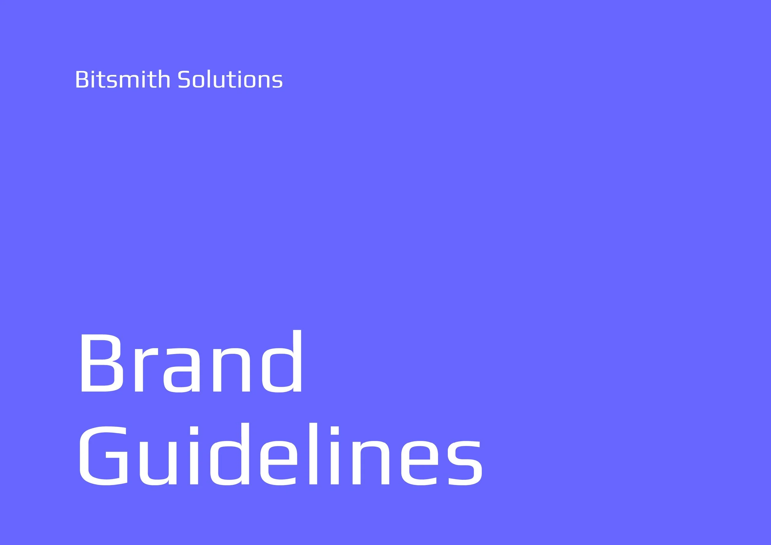
The Bitsmith Solutions logo is a visual representation of precision, security, and innovation, built around the idea of "forging" an advanced ecosystem for aviation technology and wireless communications. At its core, the logo is based on a single bit (a square)—a fundamental unit of digital technology—symbolizing the company's expertise in secure and cutting-edge solutions for law enforcement, government, and military applications.
Key Design Elements:
Geometric Precision:
The square (bit) serves as the foundation of the logo, reinforcing stability, security, and structure—key values in mission-critical communication and aviation technology.
The logo’s construction suggests engineering precision and reliability, aligning with the industry’s demand for high-performance solutions.
Forged Complexity in Minimalism:
The bit transforms into a multi-faceted, interconnected mark, visually representing progression, connectivity, and technological sophistication.
The form may incorporate subtle bevels or layered structures, nodding to the forging process—a metaphor for crafting resilient and innovative solutions.
Motion & Forward Momentum:
The design conveys movement, hinting at progress, evolution, and the future of technology in aviation and wireless communications.
Possible use of angled cuts, gradients, or modular repetition to imply data flow, network connectivity, or flight paths.
The Prima Pilates logo features a sleek, minimalist wordmark with soft, flowing script, reflecting the brand’s blend of grace, strength, and elegance. With clean lines and warm tones, it embodies the studio’s upscale yet welcoming atmosphere, representing both luxury and empowerment.
Prima Green - A color that represents balance, harmony, and nature, green can help to relax and energize the body. It can also symbolize growth, health, serenity, and tranquility. Green is a good color for a Pilates studio because it can help to exude health, rest, and stress relief.
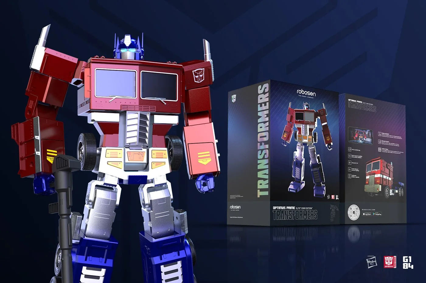
Transforming the Unboxing Experience: Elite Optimus Prime Packaging & Launch
As Creative Director at CRISPx, I led the concept and execution of the Elite Optimus Prime packaging and go-to-market strategy—transforming a collectible robot into a premium, must-have experience for fans and collectors alike.
Premium Packaging with Purpose
We approached packaging as more than just a container—it became the first touchpoint of the brand experience.
I directed the use of luxury-grade materials, including heavyweight matte-finished board and a magnetic enclosure that reinforced the product's premium tier.
To amplify visual impact and exclusivity, I introduced an iridescent foil-stamped Transformers logo, tapping into the psychology of rarity and collector value.
The result? An unboxing experience that mirrored the drama of the product itself—and helped justify the price point, contributing to a complete sell-out during the pre-order phase.
Story-Led Marketing Strategy
Our campaign leaned heavily into storytelling, design, and emotional resonance to activate both nostalgia and awe.
Teaser Phase:
I led the creative direction for a suspenseful teaser campaign, developing a landing page, countdown visuals, and social-first content that hinted at transformation—without giving too much away.
Launch Phase:
We unveiled the product with a full product launch microsite, custom email campaigns, and interactive social story content. I ensured every visual aligned with our product’s futuristic, high-end tone.
Hero Visuals:
Under my direction, we produced 3D renders, cinematic product photography, and animated graphics to showcase the robot’s detail, transformation, and advanced engineering—positioning it as a marvel of collectible tech.
Narrative + Positioning
I shaped a brand narrative that framed the Elite Optimus Prime not as a toy, but as a technological artifact—blending nostalgia with next-gen innovation. This narrative carried through every touchpoint, including the packaging, which mimicked the transformation sequence for added drama.
Media Reach & Results
I oversaw the visual identity and storytelling used across our earned media and PR outreach, which secured features in Forbes, Gizmodo, PCMag, and TechCrunch, generating 300M+ earned impressions and helping establish Robosen as a leader in intelligent robotics.
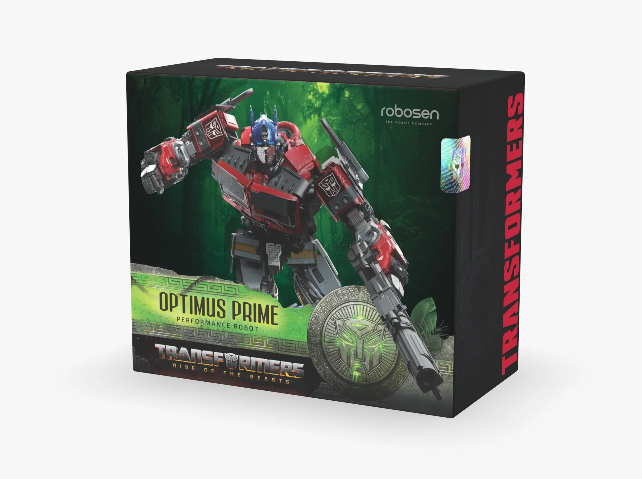
Designing the conceptual packaging for Optimus Prime is an exhilarating creative endeavor. Every element of the packaging must capture the essence of this iconic hero, showcasing his strength, leadership, and awe-inspiring presence. The packaging design should evoke a sense of anticipation and excitement, hinting at the thrilling adventures that await within.
This design has been nominated for a Design Rush Packaging Award, have a look at the article here.
Robosen x Transformers an official license of Hasbro. Conceptual package design for the first voice activated auto converting Transformers.
Package design for the world’s smartest SSD drive. Designed to deliver what matters– Uncompromisable Performance when you need it most. Breaking traditional norms and engineered using artificial intelligence, resulting in an SSD that stays insanely fast even as it fills up.
Website Design - Los Angeles-based web development company with a highly-qualified, credentialed team, and we understand how application-specific features affect the bottom line of your business. We leverage technology in the business world and deliver that expertise through our core services.
Web Design - Unlike other cyber security vendors, who rely on post-attack indicators, OPORA focus on pre-attack adversary behavior. They track and map their entire attack infrastructure – before they launch their attacks.
Every year Cylance organizes a sales kickoff event to motivate and realign the sales staff for the upcoming fiscal year. For this project I worked with the design assets to create the large environmental graphics. We did a total brand take-over of the Hilton Huntington Beach. I created the stage design, hall-way graphics and large light boxes.
UNITE was the thread of the 2019 Sales Kickoff conference for Cylance. Working with the creative team, I designed the stage and other large format environments throughout the event space for another full brand take-over.
I designed a print and digital version of the Cylance Axiom Alliance Program brochure. A global community of cybersecurity solution providers working together to deliver a prevention-first approach to security through the implementation of advanced artificial intelligence (AI).
These are a few of the projects I Art Directed for the experiential marketing agency Limitless Creative. Working with brands like NIKE, Jordan Brand, Just Don and Station 23.
The Tier Display
Taking inspiration from the table design, this tier display will be created using multiple 4x4 wood beams in various lengths to mimic the table aesthetic. Using acrylic plates to attached patches with velcro creates an organized and visual display for customization sessions.
Materials
4.00in x 4.00in Wood Beams
1.00in x 1.00in Wood Beams
.25in Acrylic Shelf (12 total)
Velcro
Conceptual designs for a Jordan Brand Invitational that would spotlight top local and national basketball players with an elite double header at St. Augustine High School in New Orleans during the NBA All-Star week in 2017.
Located directly above the 32 South State Street store, Station 23 aims to serve elite high school athletes from the local community who are looking to take their game to the next level.
The Jordan brand celebrated the 2016 World Series win of the Chicago Cubs canvasing the city with these posters.
With the release of the Jordan XXX2, I designed these promotional t-shirts for a special event at the Jordan flagship store in Chicago, IL.
University Relations Recap Email
Digital Design
Station 23 in Chicago, IL brand take-over for the release of the Jordan Superfly 2017 React shoe.
Glassware Program
Working with Pacifico to create an on-premise program to promote the sales of draft beer, a collection of glasses were created for several markets around the country. As art director, I worked with a team of designers to come up with a visual concept. Taking this art direction, I designed a series of posters per market. Along with the poster, we created coasters and table tents for promotional visuals.
Glassware Program
Working with brand assets and artwork, I designed a series of 5 posters to promote this artisan glassware series for Modelo Especial. These posters were part of an on-premise program collateral that included, coasters and table tents.
Our client Tic Tac was partnering with the Minions movie for a promotional marketing campaign of the release of the new Minions movie. We were task to create a game like experience utilizing the Minions creative and characters.
AIADO
(Architecture, Interior Architecture and Designed Objects.)
Working for the School of the Art Institute of Chicago, I designed and coordinated the architecture department accreditation exhibition which included print materials, architectural information, way finding, environmental graphics, exhibition design and lighting which lead to the accreditation of the architecture masters program.
While attending the School of the Art Institute of Chicago, I had the honor of Art Directing and Designing the Student Union Galleries (SUGs) on-campus gallery brochures. This was a paid gig by the school for the school. I later went on to work for the in-house marketing department creating promotional collateral for future SAIC students.
This was created as promotional piece back in 2010. I took inspiration from the fire extinquisher enclosure with the instructions of “In Case of Fire, Break Glass”. With this piece, my business card was sealed within the pyramid with the instructions of “In Case of a Creative Emergency, Open”.
To this day, the thinking and simple design solution is one of my favorite ideas come to life.